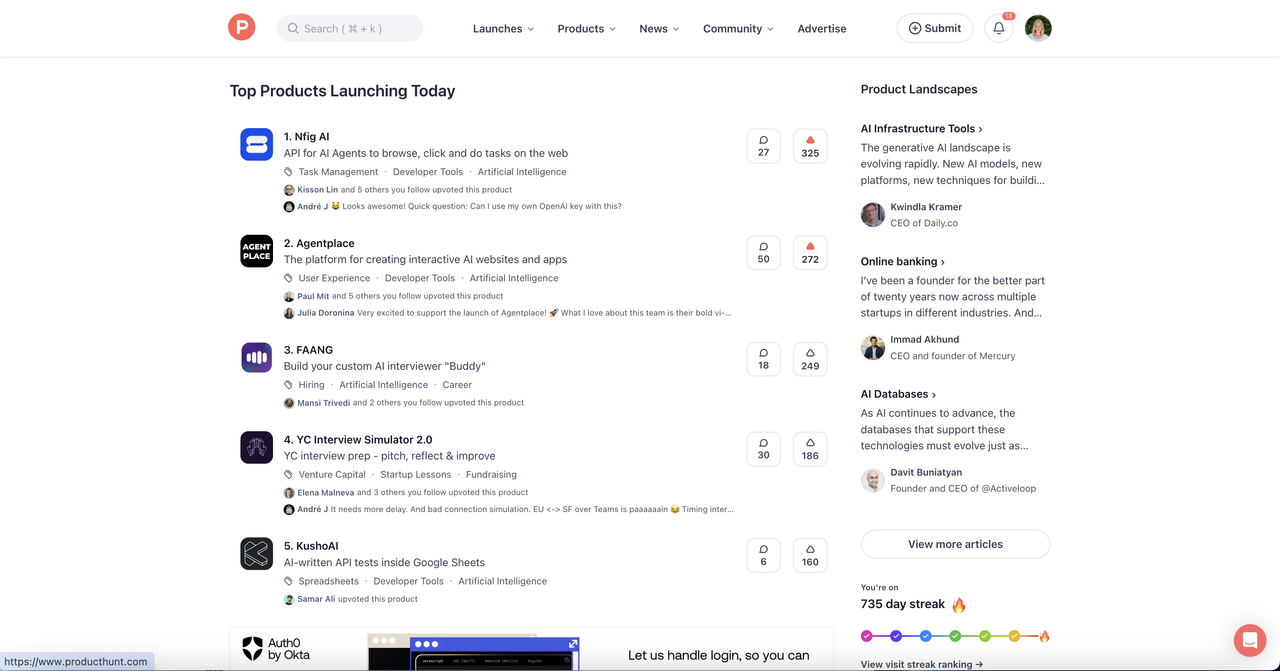
How do you feel about new Product Hunt changes?
Business Marketing with Nika
8 replies
I noticed recent changes in the web UI and I need to say that these are likeable.
+ Apart from that there appeared (probably) sponsored banners between launches.
What other changes with this platform would you welcome?


Replies
Johan Steneros@jsteneros
Looks more clear, clean and structured.
Share

minimalist phone: creating folders
@jsteneros I like it more :)

ReadPartner Portal + Extension
I like the new UI!
One thing that caught my attention, though, is how the number of comments is visible during the first few hours. It feels a bit contradictory to hiding upvotes, as it might still influence user behavior. That said, I’m curious to see how this evolves!
One change I’d personally welcome is the ability to add images to comments (for example, to share screenshots).

minimalist phone: creating folders
@morgane_prr Yes, rn, adding images is only with help of html :)
When it comes to additional suggestions, I would welcome a bigger number of notifications in circle. It is quite small for my eyesight :D
I think, that the ability to send updates directly to people who follow you and your product would be nice. Of course, with some anti-spam measures in place. For now, it seems like there isn't many opportunities to interact with them. Or maybe I'm missing something?

minimalist phone: creating folders
@karl_mechkin it would make this platform like social media. I think that it should be optional for users to get these updates. That would be fair.
I feel the same way, Nika. UI is cleaner and more task focused now. Happy with the way things are currently.

minimalist phone: creating folders
JJ, It looks fresh and belonging to 2024 – 2025 era :D @pragadeesh_natarajan