Subscribe
Sign in
What Movie Advertising Taught Me About Making a Mini Music Machine

Share On
I cut my teeth making posters and promotions for movies like Django Unchained and No Country for Old Men. Then I put those lessons into my music tech hardware.

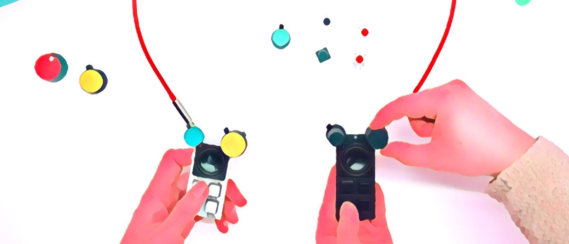
You’re looking at a thing called Bitty. It’s a pocket synth, drum machine, and sample playback device (think airhorns and “woop woop!” noises). And it’s open and programmable, so it might become much more as people start experimenting with it (I just launched it on Kickstarter).
Before I started building Bitty, I made movie ads. I fell into it straight out of art school. A quick gig rolling posters for an artist turned into my first proper “design job” making 240x240 pixel cell phone wallpapers for Def Jam mobile—think pictures of car rims, basketball hoops, and high tops. We soon went on to design websites, posters, and online experiences for some pretty good movies—like Django Unchained and No Country for Old Men—but a lot of not-so-good movies, too.

Then my creative career took what might seem like a sharp turn: I followed my girlfriend—now wife—to Cambridge so she could go to school. I fell in with a bunch of music-tech makers, started hosting gallery events to showcase their work, and eventually started building Bitty. It was a pretty big change, but some of the lessons I learned from movie advertising have informed how I’ve gone about building my product and communicating what it does. Here, I’ll share a few tips that other creators might find useful.
1. Tug the heartstrings.
I could describe Bitty as “a piece of electronics,” but that sounds a little boring. Sparking curiosity and human connection is quite possibly the best form of advertising. So I built that into my product.
I wanted to create a product that evokes ’80s kids’ fond memories of loud keychain toys; I wanted to create a product that might inspire a stranger to ask what I’m playing with; I wanted to create a product that’s really cute.
That’s why I went with a Mickey Mouse layout for the knobs and speaker instead of a run-of-the-mill horizontal game controller look. I want the hardware itself to feel like a character. And that’s how I settled on the cute name instead of something like “Alpha One” (an actual bad-idea name that I considered at one point).
2. Amplify the essence.
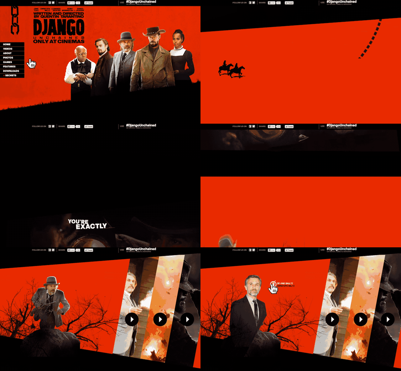
When you’re thinking about promoting an experience, you have to remember that people don’t have much time or attention, and you don’t want to spoil the surprises anyway. So an advertiser thinks about communicating the essence of the thing they’re promoting. Django Unchained was bloody and Tarantino-style “quirky.” So we made the visuals red, and kept them moving. No Country for Old Men was slow and dark, so we used a lot of black and built a web experience that takes its time.
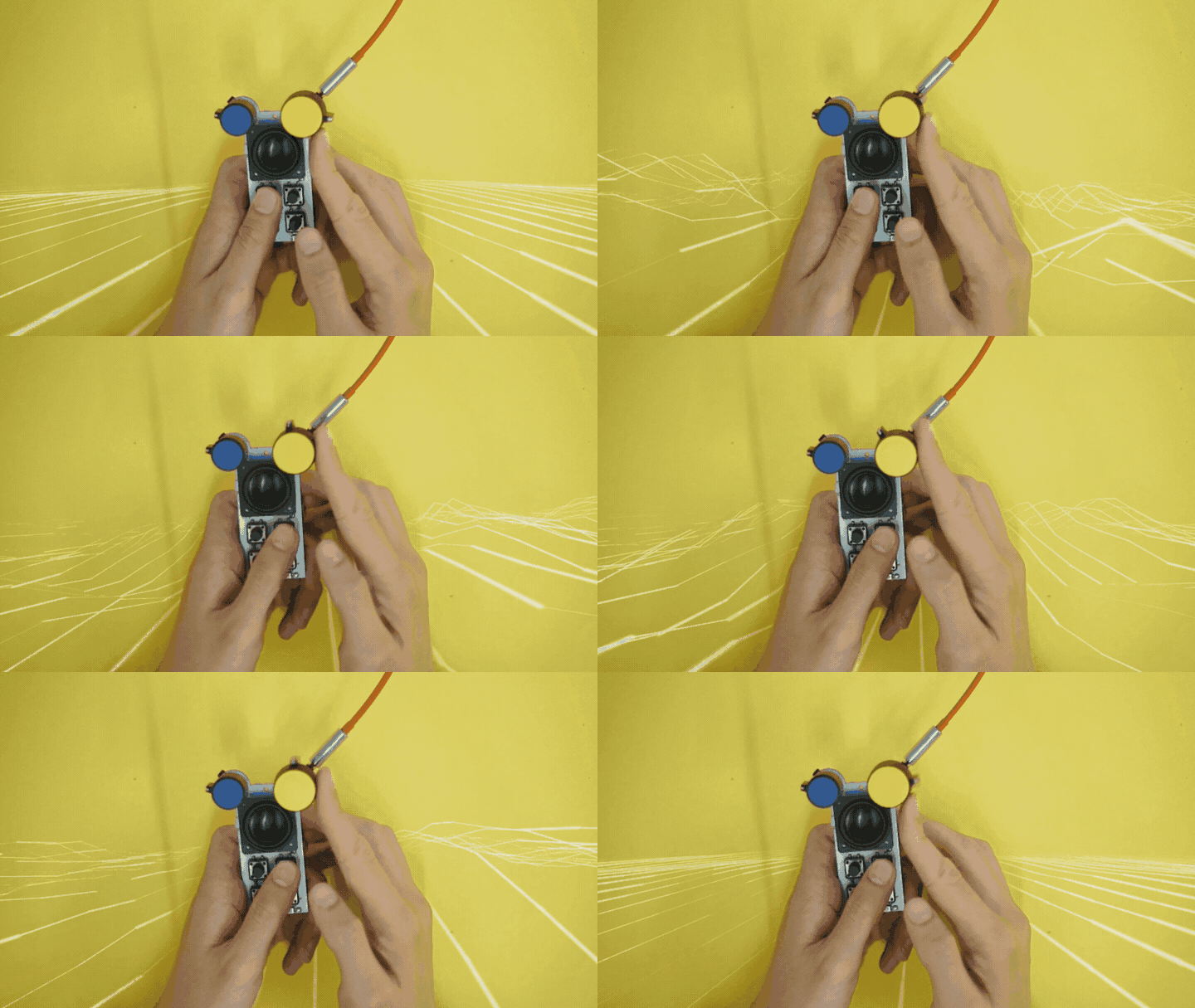
This thinking shaped how I planned promotional images for Bitty. It’s a pocket sound device, but you can’t show sound. So I made GIFs, showed hands playing with it, and layered in animations of sound waves. I also wanted to show it’s not a product that takes itself too seriously, so I went with bright, playful background colors.

3. Arouse more than one sense
When working in a visual medium, it’s effective to arouse some of the other senses. Abstract art does it all the time: a subtle color gradient “feels” smooth, strong angles and contrasting shapes “feel” sharp.
When I was taking prototype photographs, I initially struggled with how to evoke the feeling of getting hands-on with Bitty and making fun sounds. I want people to be able to imagine touch and sound even though they’re just looking at a picture.
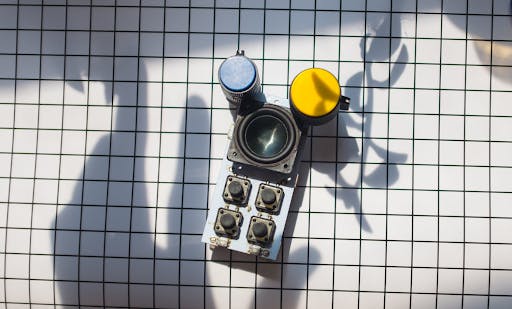
I started off with this black and white grid. It evokes precision and schematics, but doesn’t arouse many senses.
I tried sticking a plant off the frame to cast a shadow—we’ve all seen plenty of plants in product shots at this point. It wasn’t very exciting.
Then a happy accident happened: as I was adjusting the camera, I saw the shadow of my hand and realized that including it in the shot suggests a sense of touch and even a kind of sensual daytime noir. It managed to add mystique and a clear suggestion to reach out and touch this new product.
My Hollywood background has been invaluable for my product design and positioning, but I should caveat that the most notable part of my experience with Bitty has been putting my weight behind a project I actually believe in. People in advertising can easily end up feeling cynical about the products they push—I have the luxury of really believing in the power of more accessible, mobile music-making tools.
Kickstarter just turned 10. This essay by Nicholas Peter Chelyapov is part of a series that celebrates past projects and introduces a few new ones. Read more here.
Comments (4)
Alice Wonderson@alice_wonderson
Very interesting article on using movie advertising as a source of inspiration for creating innovative products! It reminded me of the movie 'Inside Out,' which describes the power of emotions and how they shape our thoughts and actions. Continued researching this topic I found out that movie reflects the importance of thinking creatively and being open to new ideas in order to achieve success. I think that's how it works with the ads as well.
Share
@alice_wonderson I do agree that it is important to experiment in the creative process and what results your creation will bring. I used to paint and sculpture back in college, but I had to stop because I decided to continue my studies in computer engineering instead. I have attended several contests and my project called “Mars in Virgo” – see here https://essayusa.com/nursing-pap... – won the contest back in 2019! Good luck!
@alice_wonderson interesting article
I recently turned to an academic writing service for help with my assignments and was impressed by their professionalism and efficiency: essay. They delivered high-quality work that was well-researched and perfectly aligned with my requirements. I highly recommend their services to anyone seeking reliable academic assistance
This article is a gem! It's refreshing to see such insightful parallels drawn between movie advertising and the creation of a mini music machine. The author's unique perspective offers valuable lessons that can be applied across various creative endeavors. Kudos for sharing such innovative insights!
John from https://techqrew.com
More stories

Mathew Hardy · How To · 3 min read
How to Detect AI Content with Keystroke Tracking

Sanjana Friedman · Opinions · 9 min read
The Case for Supabase

Vaibhav Gupta · Opinions · 10 min read
3.5 Years, 12 Hard Pivots, Still Not Dead
Kyle Corbitt · How To · 5 min read
A Founder’s Guide to AI Fine-Tuning

Chris Bakke · How To · 6 min read
A Better Way to Get Your First 10 B2B Customers
